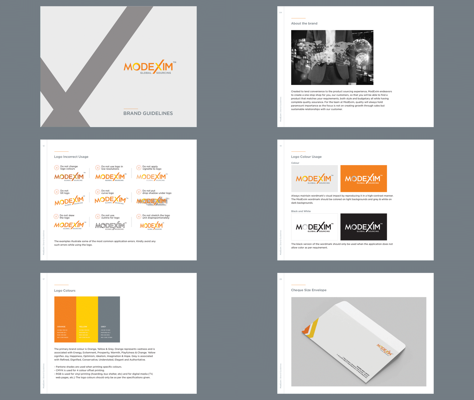
MODEXIM
MODEXIM: STREAMLINING GLOBAL SOURCING WITH CONFIDENCE
In a world where product sourcing can be complex and fragmented, ModExim redefines the experience with a seamless one-stop solution. Whether it's style, budget, or quality assurance, their approach ensures access to the right products without compromise.
With a network of trusted global suppliers and rigorous quality standards, ModExim simplifies decision-making, offering reliability and efficiency at every step. This identity embodies their commitment to making sourcing effortless, ensuring businesses and consumers alike can access the best products with confidence.

SERVICES
Design Strategy, Brand Identity, Design Language, Communication,
UI & UX Design
INSPIRATION
Inspired by the global framework of international trade, we designed in the logo features a globe within the ‘O’ motif, while the ‘X’ symbolizes the axis of global goods flow—representing effortless international trade. Designed a symbolically identity representing ModExim's embodiment of its core values and aspirations to be the premier choice for global sourcing.

DESIGN LANGUAGE
The X, inspired by the axis of the globe, is part of the design language and symbolises direction and progress, ensuring consistency and coherence. We want our design language to convey momentum, purpose and a clear path to growth.


CORPORATE PROFILE
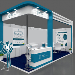
Our creative expertise in visual language is applied to communications collaterals such as corporate brochures, trade branding, digital presence and websites that enhance brand visibility and engage audiences with compelling design and engaging content.


