The Challenge: Three problems had to be solved in one system.
-
Carry the equity across: Laboratories, distributors and the medical fraternity had been buying from Advy Chemical for years. The new identity had to be recognisable on first sight, not learned.
-
Make a complex group legible: Five divisions, three subsidiaries, a CDMO arm, a sibling healthcare business and a parent group. Without a governing structure, each of those becomes its own brand within eighteen months and the group loses the benefit of being one.
-
Leave room for what does not exist yet: A group at this stage acquires, partners and spins out. An architecture that only describes today's org chart has to be redrawn every time something changes.
ADVY BIOSCIENCES
FORMERLY ADVY CHEMICAL PRIVATE LIMITED
Overview: Advy Chemical Private Limited became Advy Biosciences, and the name was the smallest part of the job. The company had built real standing in In Vitro Diagnostics under the old mark, and that recognition was worth protecting. But the business had outgrown the word "chemical", and it had also outgrown a single identity. It now runs five distinct divisions, holds subsidiaries in the US and Japan, operates a CDMO arm, and sits alongside BVD Healthcare under the BVD Group. What was needed was not a logo. It was an architecture: a system that lets a group this complex be legible to a customer, a regulator and a partner, while giving each division enough independence to sell to its own market. We built the identity, the group architecture, the portfolio structure, the division identities, the design language, and the full application system across stationery, product literature, packaging, merchandise, website and social.
SERVICES
Brand Strategy, Brand Architecture, Rebranding, Identity Design, Communication
From Advy Chemical to Advy Biosciences: The transition was designed as continuity, not replacement. The old mark and the new one are shown in sequence, so the market reads a company that has moved forward rather than one that has been swapped out. Every launch asset carried the same "is now" logic, which gave customers, distributors and staff one version of the story to repeat.
OLD TO NEW IDENTITY

is now

BRAND VALUES
Four values sit under the system and were used as the working test for every decision.
-
Precision: The category leaves no room for approximation. Exact spacing, controlled colour, consistent typography, because a diagnostics brand that looks imprecise argues against its own product.
-
Trust: Buyers here commit before they can verify. The identity is deliberately calm and institutional, avoiding anything that reads as novelty.
-
Innovation: The visual language is drawn from research itself rather than from stock science imagery, so the brand looks like what the company actually does.
-
Scalability: Every element holds from a lapel pin to an exhibition wall, and extends to divisions and entities that do not exist yet.
Precision
Trust
Innovation
Scalability
BRAND TAGLINE
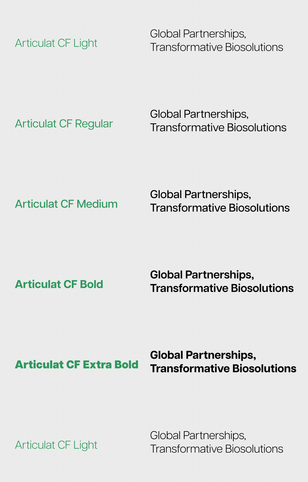
"Global Partnerships, Transformative Biosolutions" The line does two jobs at once. "Global Partnerships" speaks to the subsidiary and joint venture structure and to a company that sells across borders. "Transformative Biosolutions" moves the description away from chemicals and towards outcomes, which is the entire point of the name change. It is written to work across every division, so a Bioreagents supply conversation and a Women's Health campaign can both sit under it without strain.

BRAND ARCHITECTURE STRUCTURE
The architecture follows an Endorser Brand Model. Advy Biosciences, Advy BioLucent, Advy US, Advy Japan and the regional and joint venture entities each hold an independent market identity while carrying an endorsed "BVD Group" signature beneath their respective logos. This does two things at once. The endorsement creates a visible association with the parent group, which is what builds institutional credibility in tenders, regulatory contexts and international partnerships. And it leaves each entity free to position itself for its own buyers, rather than forcing one voice across businesses that sell to very different people. BVD Healthcare is the single exception. Because the group nomenclature already sits inside its primary identity, the endorsement signature is not applied, which avoids reading the group name twice in one lockup.

DESIGN LANGUAGE
The visual language is drawn from laboratory research itself, specifically the organic expansion and diffusion of liquids. Colour is treated as a living element that spreads, blends and evolves, mirroring scientific experimentation and discovery. Soft gradients and fluid transitions hold precision and natural movement in the same frame, which is the balance the category actually lives in: controlled method, open outcome. The expanding colour forms carry growth, innovation and the dynamic nature of biosciences. Practically, this gives the group a proprietary asset. The gradient forms are recognisably Advy before any logo is read, which is what a brand needs when it appears at thumbnail size in a feed, across a crowded exhibition hall, or on a division mark it does not directly control.


THE IDENTITY IN APPLICATION
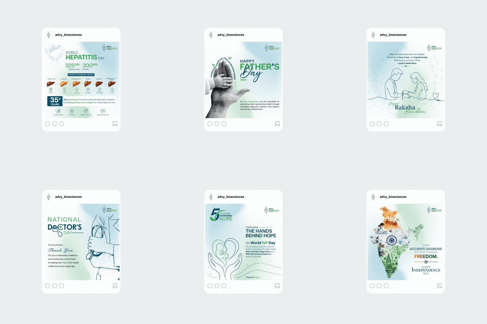
The system was rolled out in full, not handed over as a manual. Corporate typeface and colour system. Stationery, ID cards, lapel pins, diaries and bags. Product folders and the product brochure suite. Packaging across the range, including the malaria kit. Division identities for all five divisions and subsidiary lockups for BioLucent, US and Japan. Website design and the social media system. All of it documented in a 49-page brand identity guideline. A customer meeting a sales representative, receiving a kit and visiting the website encounters one company three times, rather than three versions of one company.


BRAND PORTFOLIO STRUCTURE
Beneath Advy Biosciences, the portfolio splits two ways.
Subsidiaries: Carry the Advy name and the diamond mark: Advy BioLucent, Advy US and Advy Japan. Each is recognisably part of the parent, which is what a subsidiary needs when it is opening a market where the company is unknown.
Divisions: Carry their own names and marks, endorsed consistently under the Advy Biosciences umbrella: Bioreagents, Diagnostix, Women's Health and Fertility, Advanse and Siro Prolego. Each sells to a different buyer, so each needed room to speak in its own register while staying visibly part of the same company.
The structure is written as a set of rules rather than a fixed chart, so a new division or joint venture can be brought in without a fresh design exercise every time.

The Biolucent Decision: The most consequential decision in the architecture is one most brand systems never make. BioLucent is the group's CDMO arm, a premium contract development and manufacturing partner built to take clients from concept to commercialisation. It launches as an endorsed sub-brand, "BioLucent by Advy Biosciences", so it inherits Advy's scientific legacy and credibility from day one. But it is designed from the outset to graduate into a standalone identity once manufacturing begins. That matters commercially. A CDMO sells to pharmaceutical companies who may compete with parts of its parent group, and independence is part of what it sells. By planning the separation into the architecture rather than discovering the need for it later, Advy retains the equity it lends BioLucent now, and BioLucent gets a clean route to operating as an independent global manufacturing partner without a disruptive second rebrand. Most brand architectures are built for the present. This one has an exit designed into it.
Division Identities:
Bioreagents: High quality antigens and antibodies in bulk, supplied to researchers and manufacturers. Positioned on reliability, scale and scientific backbone, and designed to read as a foundational supply chain partner rather than a consumer-facing brand.
Diagnostix: The kits division, translating precision science into everyday healthcare tools. Positioned on precision, accessibility and credibility, with a mark built to survive being printed small on a kit box and still read cleanly.
Women's Health and Fertility: Specialised solutions combining scientific rigour with empathy. This is the one division whose buyer includes a patient, not only a professional, so the identity carries warmth the others do not, positioned on empathy, empowerment and trust in science.
Advanse: The research and innovation division, carrying the endowed line "The Ansuya and Vinod Daftary Centre for Scientific Research" within its lockup. Positioned as the R&D engine of the group, with a two-tier lockup built to hold that longer descriptor without the mark losing authority.
Siro Prolego: The specialised diagnostics division, delivering advanced laboratory solutions built on quality, efficiency and innovation. Positioned as the diagnostics and laboratory excellence arm, speaking to a laboratory decision maker rather than a clinician.


PROVEN RESULTS
Not a new logo. An operating system for a group that is still growing.
Advy Chemical became Advy Biosciences at the same moment the business became a group: five divisions, three subsidiaries, a CDMO arm and a sibling healthcare company under a parent. A rebrand would have solved the name. What was needed was a structure that could absorb everything the group has not done yet.
9
IDENTITIES, ONE SYSTEM
Parent, subsidiaries and divisions
Advy Biosciences, Advy BioLucent, Advy US, Advy Japan, plus Bioreagents, Diagnostix, Women's Health and Fertility, Advanse and Siro Prolego
1
PLANNED TRANSITION
An architecture with an exit built in BioLucent designed to graduate from endorsed sub-brand to standalone CDMO identity once
manufacturing begins
-
An Endorser Brand Model that lets each entity hold an independent market identity while carrying the BVD Group signature. The decision to exempt BVD Healthcare, because the group name already sits inside its identity, is the kind of detail that keeps an architecture clean instead of merely complete.
-
Five division identities built for five genuinely different buyers. Bioreagents speaks to a supply chain manager, Diagnostix to a healthcare provider, Women's Health and Fertility to a patient as well as a clinician, Advanse to the scientific community, Siro Prolego to a laboratory. Each has its own register. All five are visibly one company.
-
The BioLucent transition designed in advance. A CDMO sells independence to pharmaceutical clients, so the architecture lends it Advy's credibility at launch and gives it a clean route to standing alone later, without the cost and disruption of a second rebrand.
-
A design language drawn from laboratory process, the expansion and diffusion of liquid, rather than from stock science imagery. It gives the group a proprietary visual asset recognisable before any logo is read, which is what holds a system together across division marks the parent does not directly control.
What this means for a brand manager evaluating us: the moment your company outgrows one identity is the moment brand governance stops being a design question and becomes an operating one. New divisions, a joint venture, a market entry, and suddenly five teams are each making their own version of the brand. We build the architecture that decides those questions before they are asked, document it so it survives the people who commissioned it, and design for the entities you have not created yet.


